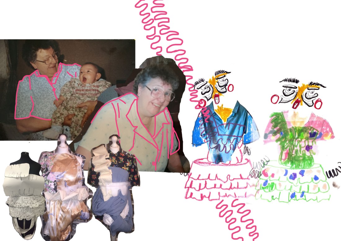
For this board, I wanted to concentrate on the top half of the garment. From my proposal at the beginning of my FMP I said that I was only going to do one garment, however through my research and surprising myself further I have decided to do more than one garment. For this design board I wanted to concentrate on looking at the top part of the garment and what I was going to take from my stand work and research in order for me to develop into a design in which I want to take forward into a final design. I really like the layout of the board because it shows clearly parts of my research and my stand work, which helps me when I come to a point in my sketchbook in which I really like a design and want to develop further. I will take this idea of using a shirt and a pillow like shape top further by looking at different shaping and altering different parts of my research of my nan’s original shirts and stand work. Turning the shapes and enlarging and decreasing them and tracing the shapes to place in different areas of the garment. However, after having a one to one with my tutor on design boards I need to add in a clearer more finished design of what the shirt looks like first and then developed to show my progress with out colour so that the silhouette is clear to the viewer in which I want to develop.


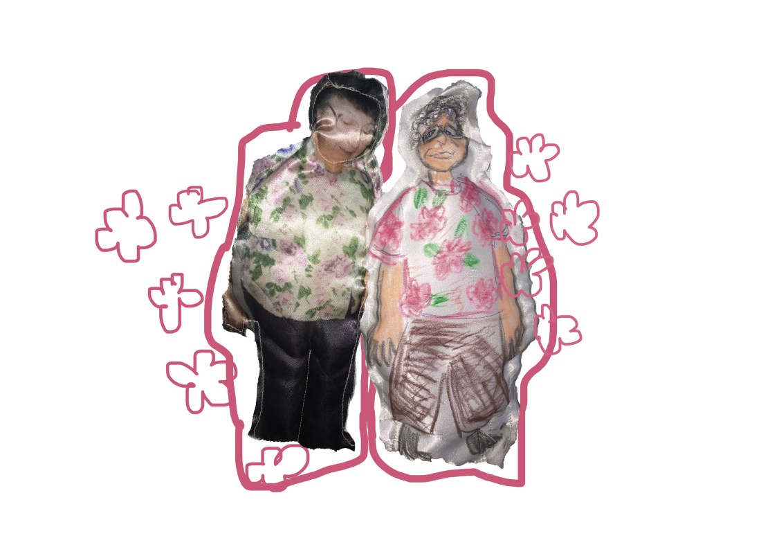 From visiting Only Human: Martin Parr exhibition I came across Fotoesculturas, a style of art in Mexico that creates photo sculptures, hand-carved from wood and incorporating a photograph transferred onto the wood. Making the image look 3D. I really liked the idea of making the image 3D and from the amount of pillows and teddies in my nan’s flat I came up with the idea of transferring a picture and then creating a doll by stuffing it with padding to make it like a pillow. I first tried with printing an actual imagine of my nan, I knew that the print would be successful because I printed onto a synthetic material and then I wanted to draw one using oil pastels. when sewing the pieces together I wanted to sew around the doll but inside out so that you wouldn’t see the sewing, however after stuffing the doll, the open part that I would have to sew would be the only part that I couldn’t hide I would have to sew it on the outside. So I decided that I was going to have the sewing visible around the edge of the doll which I really liked after because it gave it character and made it look ragged and old which is like her other teddies and pillows that she has in her flat, it shows time. I could develop this further by embroidering the my nan using the embroidery machine to then create another texture for one of my dolls.

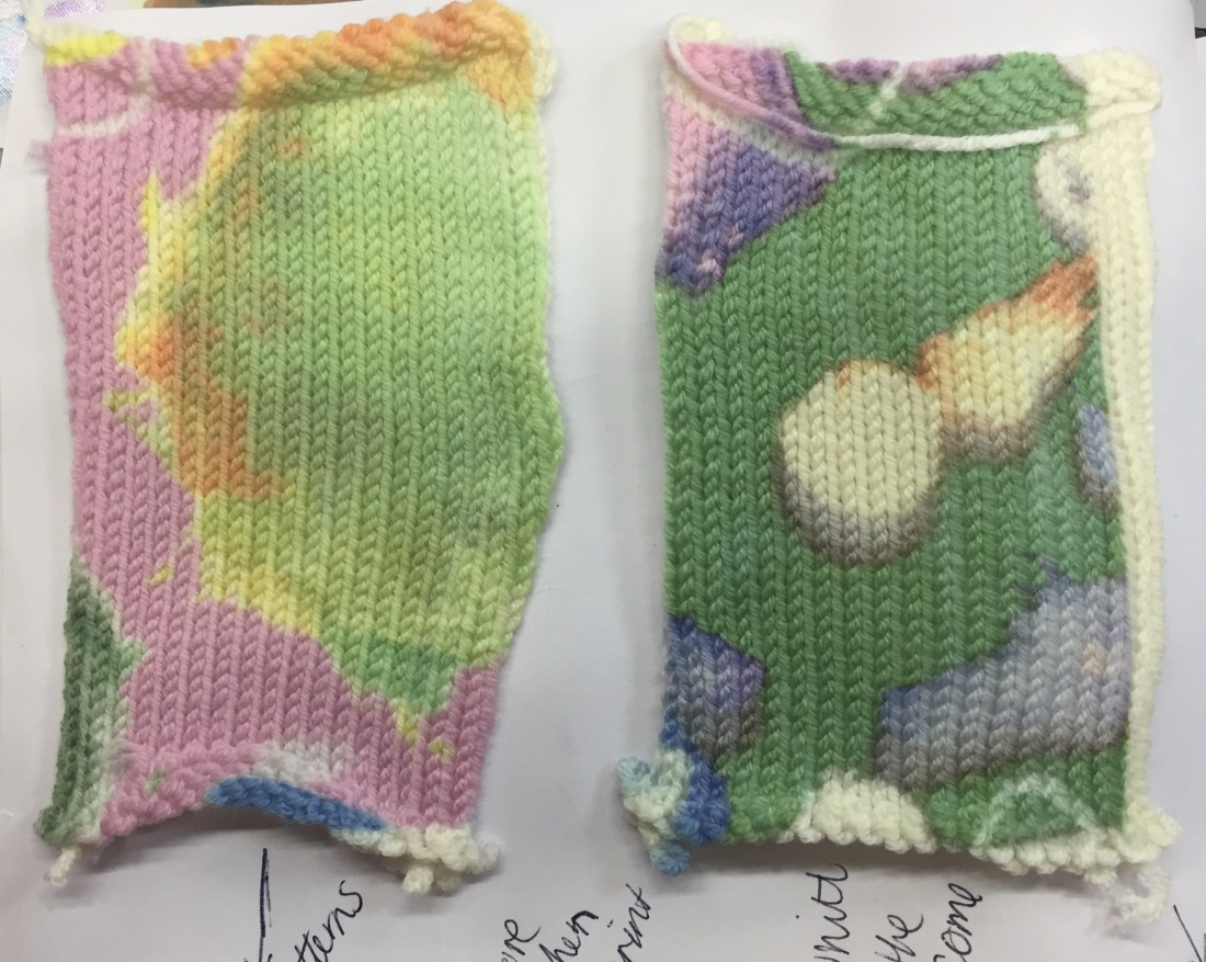
 Each print is successful, however the green and the orange print was the best out of all the patterns, the pigmentation of the orange and the green are successful as they have both kept the boldness of the colours from the original print done of photoshop. However, the pink and lighter prink colours have faded on the fabric. The pink has faded compared to the other colours but still visible and really quite like that it is faded. The lighter pink has faded into the nude colour of the pop sock but the other colours from the paint have come out as they are darker. I could develop this further if I wanted to make the colours brighter on the pop sock by making the print itself darker or brighter on photoshop so that it would come out brighter on the sock.


