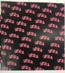
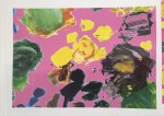
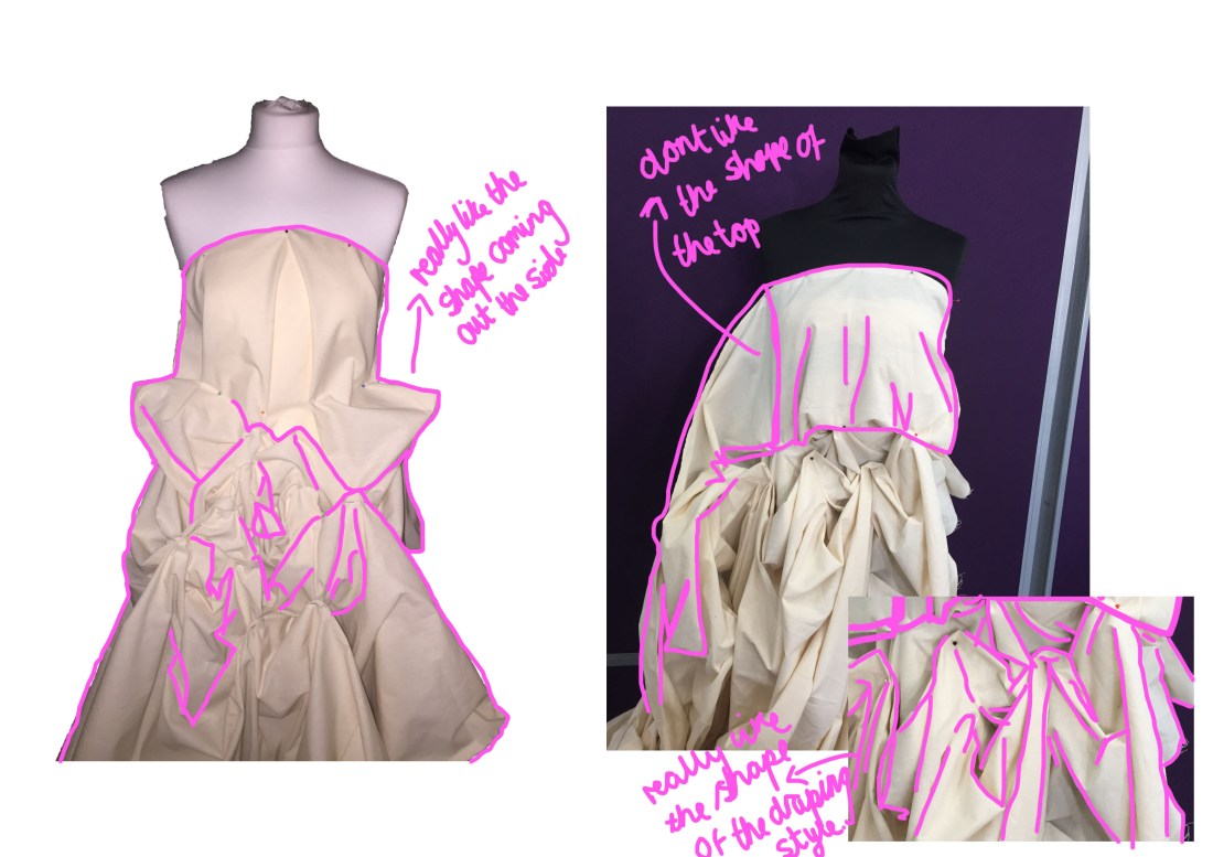
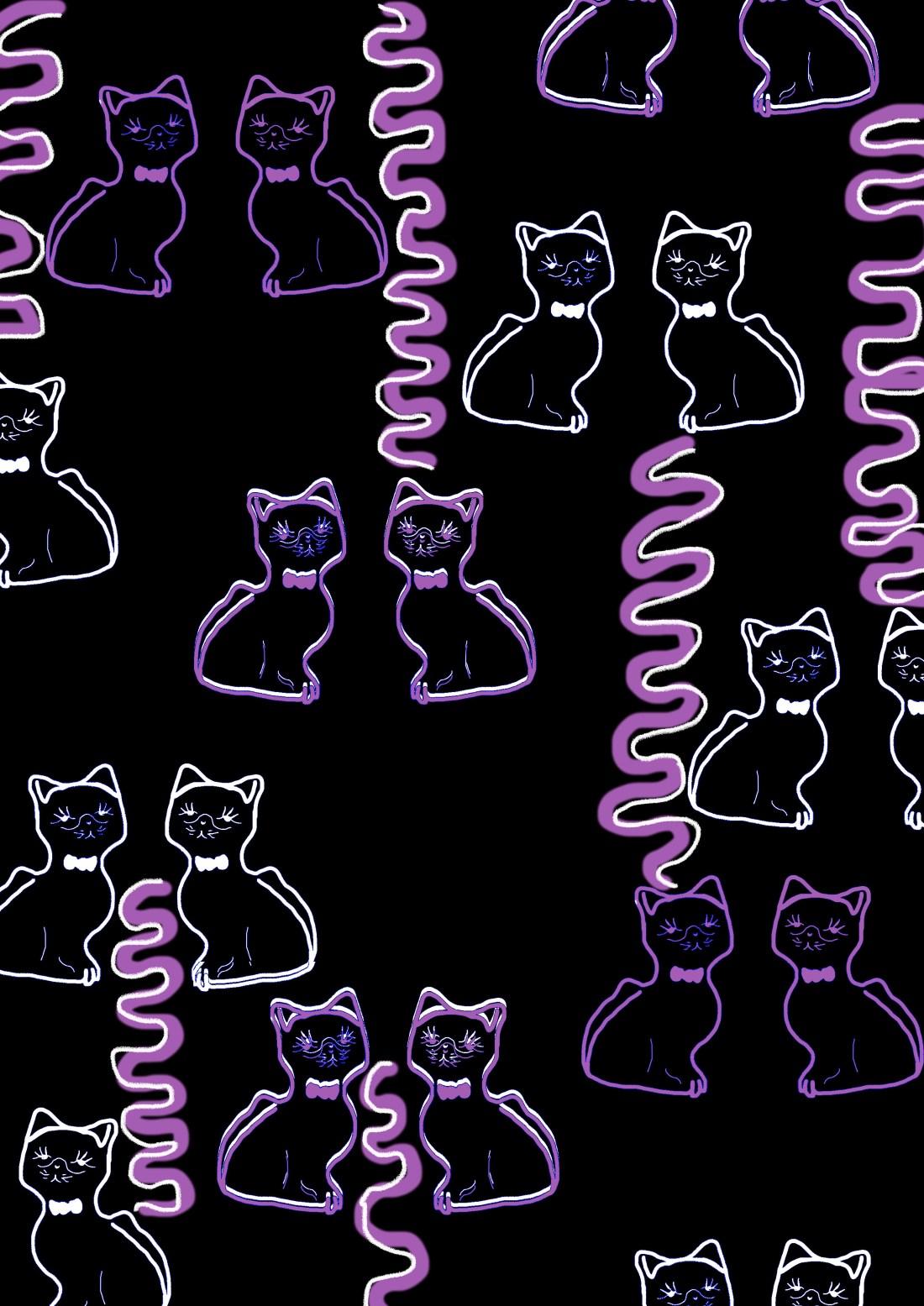
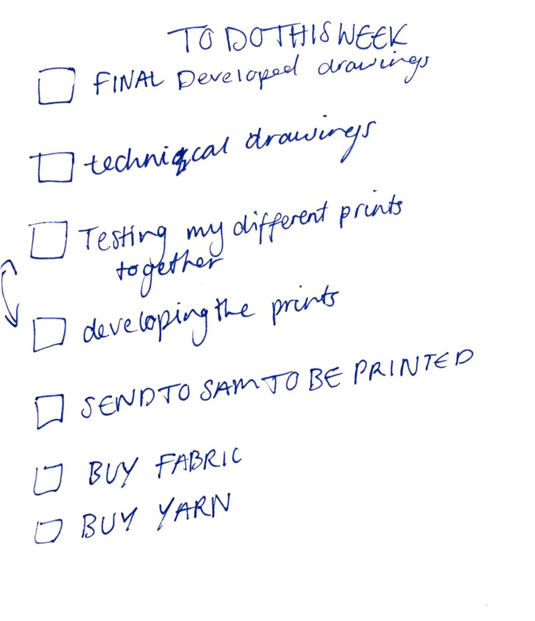
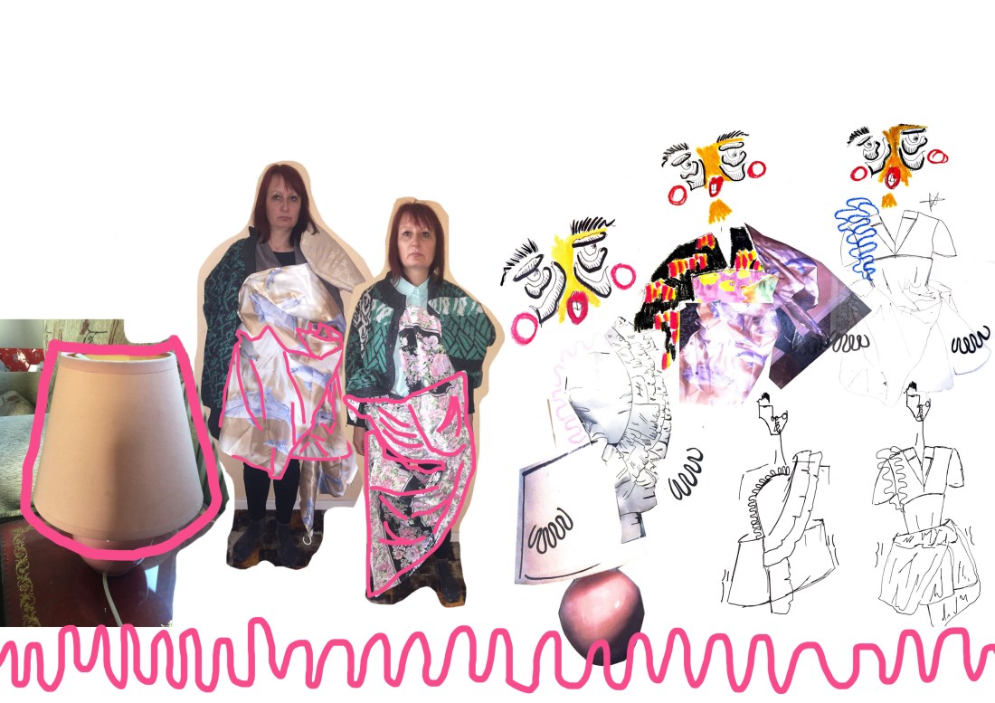
After finalising my ideas and choosing the prints that I wish to take forward, I feel that I need to make it clear about what I am making and what I want to draw as a technical drawing of the design that I want to take forward to see where I’m going to put details and zips and to see an overall look at what the shape might look like and any changes that I want to make. I can also use the technical drawing to help me consider where I want my prints to be on each of the garments. For the design that I want to take forward I wanted to develop just a few times more adding in shorts for under the skirt as I didn’t realise how high the skirt is at one of the side where I take it up by the ruching. Having the shorts underneath helps hide undergarments but also I feel completes the look. First getting the idea from my nan nappies and the idea of old age and her time in Bermondsey. I have develop these shorts in other designs and wanted to take forward to my final garment. After doing my first technical drawing I wanted to add a few more details such as the placement of the ruching in which I developed on the shirt and also change the shape of the skirt because I didn’t like the shape and thought that it would be unrealistic to be able to get the exact shape. After doing another technical drawing with the changes made I finally like the silhouette and thought that the drawing was clear for me and the viewer in what I wanted to design if I was to send it away. The other designs for my final line up I also developed and made a few changes and successfully created technical drawings for which will help me when testing my prints. I tested a few prints that I wanted to take forward together on my first design just to see whether they would go but as most my prints are quite dark from the filters that I have chosen the garment just looked to dark and you wouldn’t really be able to see the details when the garment would be made. Choosing the pink paint design with the dark pink repeated print I thought surprisingly went really well. With the lighter pink in-between it broke up the black from the shirt and the shorts which I really like when doing my first print placement. The other I tested just to see whether they would work but the first one really interested me to take it as my final design. After having chose these prints i tested them on the other designs and tested the placement on the garments to see the positioning and which one I like to take forward to my final lineup. I wanted to do a final lineup because I had a few designs that I wanted to take forward and develop further.
FMP Print Development
Through my research of my nan I wanted to some way involve prints, having seen her flat and clothing, the whole house is full of mixed match prints and objects which I have taken forward and rendered to trends now to make it new and developed. Having picked out my final prints that I like and what to take forward, I want to develop more because when I first created these prints I feel as though I haven’t developed them enough. Testing the positions, size, colour and filters that I have tried on photoshop to see which print I like the best and will work together in my technical drawings as I render them on the design. I wanted to keep the colours bold after going to Only Human: Martin Parr exhibition with his use of photography and making the colours in the photographs come alive and Mainly just keeping to the colours from the original print in which I tested before and chose which one I liked or the filter changed the colour. When developing these prints I knew that I had to keep the colours and shapes to the trend that I found on WGSN which then links to my customer, keeping the customer in my mind when choosing my final designs. The two designs that I didn’t want to take any further was the grey kitchen scene print I didn’t like how it came out the colours look really dark and the shape of the kitchen isn’t clear to see that its a kitchen and I really don’t like the colour of the green my nan doesn’t really have green in her flat only the carpet. The other design that I dont like is the scene print which is a print which shows the change of Bermondsey, after developing the print I wanted to try different filters to see what the filters would do to the line drawings, however the filters made the image look darker so that you can’t actually see the print only the top layers which doesn’t clearly show Bermondsey so the print wouldn’t really make sense, also placing with other prints I feel would be hard as most of my other print are quite dark so the garment as a hole will look to dark. However the two prints that I will be taking forward and really like are the pink flower print with the paint and the print repeated print. I really liked the paint print when I first created the print but I thought that the pink was to bright for the pink so I toned down the pink to make it a lighter shade which then I took this idea forward and changed the pink on the black design so that the colours ran through together. I was worried at first with this design as there is so many different colours and would find it hard to match with but it was successful. As I said at the beginning with the prints coming mainly from my nan’s furniture and clothing I wanted to combine these areas of my research together so that the paint design represented the flower patterns in my nan’s flat and the black design is from my nan’s clothing in which I extracted the shape from originally. I also really like the colours how they have revived the prints from the originals into something that somebody young could wear.
FMP Final Developments
From here after choosing my final drawings and collages from my whole investigation of my nan, I have used these to then help me to draw further designs and really refine my ideas to my chosen design. Taking techniques and silhouettes that I have liked and placing them together and developing that further so that I have a variety of designs to choose from. From there I have chosen my five final designs that I will take forward into developing by testing my different prints but will use in my final lineup. Some of the designs I will not be taking forward as they just didn’t work or I don’t feel as though my customer would buy them and thats really important that I consider these designs from my customers point and what I have based my customer on. The design that I wish to take forward is the design with the shirt and knitted top with the lamp shaped skirt, I want to take forward this design to be made as my final piece because I feel that this design represents every part of my journey and research into my project every part of the garment has an explanation about my nan. I also really like the textiles that I have added to the design such as the knit because it makes it more interesting and added texture instead of it being just one fabric all through if that what I chose to take forward. I also wanted it to be a challenge for me by making a shirt and problem solving how I’m going to get the skirt to stand out and up against the body, printing on the knit. Whereas the design that I won’t be taking forward is the top that comes across the shoulders and long shorts. I didn’t want to take this design forward because I just didn’t like the silhouette overall it was very clear and developing it didn’t refine it either, also when looking at the design I didn’t see the whole of my nan in it like it didn’t really tell a story of my research. Also having done research on WGSN the silhouette shapes didn’t go with any of the trends or upcoming trends and looking at my customer research I don’t think this is what my customer would of brought if it was sold in a shop. The other designs that I have chosen to take forward to my final line up, also are clear to what I have research and I can also see linking with trends that I have research such as the rushing and gatherings and knit that I have found in my research.
FMP Calico Draping: rendering silhouette ideas
From my last draping by using some of my nan’s clothing and objects from her flat, my developed drawings from my further draping and research, I wanted to then take these shapes from drawings and stand work to use on a more structured fabric such as calico. By using a plain material as well it make it easier when trying to investigate the silhouette of the draping more then patterns and general shapes of the garment. With calico being a strong material it really helped me with structural shapes that I wanted to test from my research that I might not have been able to do with other materials. I feel that this stand work was the most successful and I really like the shape that I created especially with the calico coming out at the sides and holding this shape. I extracted that from my drawn designs and found that process from 2D to 3D was successful. However, with the fabric that I might use is a much lighter fabric so I need to think of a way structurally holding the fabric to the side, away from the hips. I could develop this idea by maybe using sticks and shaping them so that they rest on the hips and across the body so that it holds up. However whats not working on this stand work is the silhouette. The silhouette doesn’t look clear and I really don’t like the cut off from the top and the bottom half of the dress. However, I do really really like the detailing on the skirt part of the dress and will take this technique forward when extra details and shape for my finial designs. The shapes that I have experimented using calico relates to my customer profile because these are different shapes that you would not find in everyday clothing so from my customer profile I have made my customer young and full of confidence to wear shapes that I have experimented on the stand.

Print Development: Greyson Perry
From my research of Greyson Perry looking through books of his work especially from he’s series ‘All in the Best Possible Way’ where he looks at all the different classes and whats common in each class which he uses for inspiration for he’s final tapestry’s. Looking through he’s books I also found an image of a pattern using objects from a house in which he has drawn and then added shapes around the objects. Using objects inspired from my castings before I wanted to use these objects especially to use the statues of the cats. I thought they where really sweet looking and my nan had them on her window seal in her room which she also got from a market stool in Bermondsey, so I wanted to use these objects to then create another pattern with using a similar style to Greyson Perry’s work. I really like how the pattern has turn’t out testing the print with different colours that I have extracted from the print before that I based on my nan’s flower wallpaper which she has everywhere in her flat which must of been a theme in the 60s because its is everywhere in her flat such as the pillows, wallpaper, clothing and magnets. It relates with Greyson Perry’s work and with the bright colours its really suits being on a younger person who’s confident to wear bright colours. I feel that I will take this print forward to see whether it will go with the other prints that I have made but when it comes to my final designs I might not use it. I want to develop it further by testing out different filters but I really like the original pattern already.

FMP Check List
For this week before I come to making my final garment I need to create a check list so that I know personally that I’m on the right track. I’ve already have the one that I created on my proposal which I have been keeping to, however creating a list which I can tick off on paper, keeps me up to date, but it also helps with stress because when I tick it off I know its done and I don’t have to worry about it anymore. Now moving onto final designs i need to finish my designs and chose what I want to take forward. From there looking at drawing technical drawings to help me know what my garment will finally look like and where I’m going to put details such as zips and then by adding CAD prints on the technical drawings, which I need to refine and chose which prints I want to put together and see whether they go together, and where I want to place them onto the garments. I want to have my list done by the beginning of next week so that I am ready to make my garment for the week. However, I sometimes struggle with my time management so doing these check lists keeps me on track and are useful for when I have my one to ones with my tutor because I can tell him what I have done and then create a new one from his critiques.

FMP Design Development Favourite Designs
After further investigating with more draping using calico to create shapes and to start identifying my silhouette for my final design. I wanted to create a board which will allow me to refine my ideas so that I can just concentrate on developing a few designs for one final design in which I want to take forward into creating and then the rest of my lineup with designs that I really like but just didn’t take forward to making. Each of these stand work and designs have something that I really like about, such as the gathering and maybe the shape of the skirt in which I will take forward to develop and combine with other designs that I really like to develop further. Whenever I design I always consider my customer, What would my customer wear? Will they buy it? So using different designs and combining them together with my customer in mind and plus my designer research will help me to take on these designs from my board and take on further for final designs. Adding a few of my designs onto the board from these stand work also helps me to know what way I want to take my designs and how that links to my research. Using drawings from my research and collages which I really like because they have a variety of shapes and textiles and combining them, these are the designs that I will take forward.
FMP Development with Castings into fabric
My Favourite casting was the one of my nan’s jewellery boxes. I really liked the print made from the glass and the texture from when you look at an image you can almost feel it. The glass also creates a diamond effect on the top making the casting have a bumpy effect to it. I wanted to develop this idea by using some materials and techniques from my research to help evolve this idea of casting into something that may help me in my research or to take forward to my final ideas. From my response to the pillows and stuffing them I wanted to use this in developing this casting into a pillow style. But first just trying onto different fabrics without stuffing it, so that I can see if sewing the print style will do anything to the fabric, which it didn’t and won’t be taking further into designs. However, once I started stuffing the fabric and sewing over it I really like how it looked and stood out creating a different type of texture. Keeping that shape which is what I wanted to capture. Testing with different materials, such as knit and satin and then a harder fabric calico to see if you would be able to get the same effect with a harder material to achieve that pillow look. I really like how each of the fabric have come out especially the satin because it gives a soft look and texture which captures perfectly pillows, instead of the calico. However, I don’t think that I will take this idea further because it quite a solid structure and quite hard to shape to the body which is what I have focused my silhouette on so that it is fitted. Although it does link to the trends that have come up on my WGSN research I won’t be taking it forward.
FMP Design Board
Looking closer at the idea of my nan lamps, combining with some stand work using some of my nan’s materials. The silhouettes of my nan’s lamps are simple but she’s had them forever, so that connection with her and Bermondsey growing together is really implied by the use of the lamps. But I also I wanted to imply by using a lamp, about living and where lamps are always located in a home, how my nan has lived in Bermondsey all of her life. Testing the size by enlarging then making them smaller against my model, combined with some draping using materials in her flat. I really like how they stick out at the side which makes the garment looks more conceptual and not the typical silhouette, exaggerating the shape of the lamp. I’m really excited to take forward this design, but when making my toile will be a lot of problem solving. To be able to capture the shape and make it stand out from the original silhouette of the body, and fit the body with out falling down, which I will experiment when I come to my toiling. I feel that this would suit my customer because its conceptual and something new which is what my customer looks for when buying clothes. Then adding a shirt from my research and from the draping. The stand work that I have also added to my board are my favourite I really loved how the shower curtain shaped naturally by pulling the fabric upwards, to create different shapes so that I didn’t just copy the natural shape of the lamp I wanted to add detail which I will be taking forward in my designs. 
FMP Further Silhouette Research
Continuing to look at silhouettes using furniture from my nan’s flat I wanted to use more original furniture that she’s had for a long time and consider using it for an idea to help with the silhouette of my designs, because I feel that I keep repeating the silhouette until now. Looking at the rooms in the back of her flat where she stores old furniture, carpets and photos. I came across little lampshades that she used to have in her room. I really like the idea of using a lampshade and extracting ideas such as making the image bigger and smaller, I also really like the style of the lampshade and colour. This would link to my customer perfectly because my customer is always looking at new trends, looking in new updated magazines so she would know that pink and especially lighter pink are in right now. Having a lamp shade in that colour and with the whole theme of time and bringing back old objects would suit my customer perfectly. It relates because it shows times but not just that my nan said that she got it off of a market stall in Bermondsey, so that relation to Bermondsey and staying in Bermondsey for her whole life linking all through her flat and the objects that are in her flat. I really liked the idea of having the shape of the lamp enlarged so that it won’t fit perfectly around the waist, that it will actually come out at the sides to make the waist look more dramatic and like the top of the lamp. I really like this idea and wish to take this further by linking it to some of my stand work for the bottom part of my skirt.


