FMP development Board

3rd design board

For this board, I wanted to concentrate on the top half of the garment. From my proposal at the beginning of my FMP I said that I was only going to do one garment, however through my research and surprising myself further I have decided to do more than one garment. For this design board I wanted to concentrate on looking at the top part of the garment and what I was going to take from my stand work and research in order for me to develop into a design in which I want to take forward into a final design. I really like the layout of the board because it shows clearly parts of my research and my stand work, which helps me when I come to a point in my sketchbook in which I really like a design and want to develop further. I will take this idea of using a shirt and a pillow like shape top further by looking at different shaping and altering different parts of my research of my nan’s original shirts and stand work. Turning the shapes and enlarging and decreasing them and tracing the shapes to place in different areas of the garment. However, after having a one to one with my tutor on design boards I need to add in a clearer more finished design of what the shirt looks like first and then developed to show my progress with out colour so that the silhouette is clear to the viewer in which I want to develop.


FMP Developing Knit

After testing the printing onto knit I really wanted to evolve the style of the knit by adding a design that I could make on the knit machine. Looking back to diagnostic stage of foundation and doing a week with one of my tutors where we focus on using the knitting machines and different techniques that you can create by using the tools given in the knitting machines. I remembered that I saved some videos of my progress of each of the different techniques and really fell in love with the lace knitting where you take one of the needles away so that it doesn’t connect onto the needle and you are left with a hole. This video was so helpful especially at this stage where I’m starting to really focus on what textiles that I want to take forward in my designs. From my research into knit, my nan at her age and since I can remember, my nan has always worn knitted cardigans, also from when my mum was younger she would always be knitting socks or hats for her kids. I wanted to incorporate this idea of her knitting past and now that she doesn’t do knitting but wears it. Knit has always been incorporated into her life and I want to include this into my final garment. However, I want to relate this to my customer as she is young and quirky, so I don’t just want to make an ordinary cardigan I want to use the idea of knit in a textiles sense, but with the shape of the garment I want to make it look appealing for the younger generation. From focusing on the shapes of pillows on the top part of the garment I was thinking of creating a bandeau top style but still need to develop and research into different shapes. However, with the idea of this bandeau it looks young and would be worn by someone who has confidence in there body which matches my customer perfectly. I really liked the testing of the printing  onto knit because it also captured the theme of time in my project with the old and new. With the understanding of the use of knit links to my nan’s past in knitting, then using an updated print with the trends that we have now, just combines the theme of time perfectly and will take this idea of printing onto knit forward to my final designs. From extracting shapes from my nan clothing I have found a reoccurrence in diamond shapes, which I have developed by using the acrylic and laser cutting but I didn’t want to take that idea further so, I want to develop it further by using a different material. From the tutorial back in diagnostic stage it gave me the idea of creating a diamond pattern using the knitting machine, which was really successful. I then wanted to them develop it further by testing printing onto the knit with the diamond lace. I know from last time printing on to knit that the heat press flatters the knit so I was worried if the holes from the diamonds would close up, however I was pleasantly surprise because the heat press actually made the diamond shapes clearer then before. The knit which I will print on and do the diamond pattern I will take forward to my final designs.

FMP Responding To Grayson Perry:Embroidery Machine

In relation to Greyson Perrys tapestry work as part of my research from he’s program ‘All In The Best Possible Taste’ I wanted to create my own style by experimenting using the Embroidery Machine. By using the embroidery machine I was able to sort of exemplify the textures of a tapestry but using rooms from my nan’s flat to show what her flat looks like now using the same technique as Perry by using photoshop and drawings to create this scene. I really like how the embroidery has come out making the fabric feel thick, how well the embroidery machine has made the small sections such as the handles on the cupboards and the buttons on the microwave clear so that you can understand that its a kitchen. The only thing that I didn’t like was some of the colours that I got mixed with some of the objects such as the microwave screen I accidentally made green instead of a grey. I also could of added in more detail such as placing my nan and making it like a scene like Perry has done, to create a story behind it. However, I could develop this into a preheated pattern and experiment with the colours in the pattern so that it isn’t just one colour. I do like this print but, I will not be taking this on further to develop for one of my final garment because of the timing of embroidering a whole print and also I don’t just want to focus on one part of my nan’s flat or an area I want to show the change in time of her through the style of her flat father then just one room, which is not being demonstrated through this print.

FMP Construction Of Doll

dolls
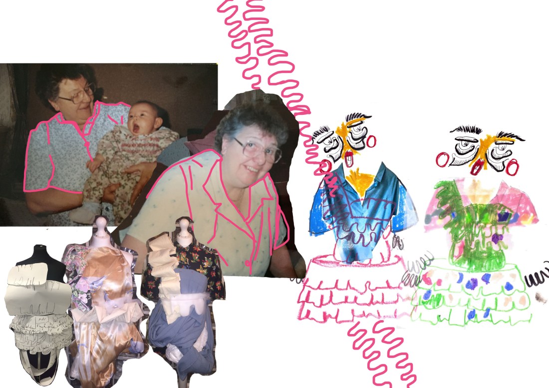
From visiting Only Human: Martin Parr exhibition I came across Fotoesculturas, a style of art in Mexico that creates photo sculptures, hand-carved from wood and incorporating a photograph transferred onto the wood. Making the image look 3D. I really liked the idea of making the image 3D and from the amount of pillows and teddies in my nan’s flat I came up with the idea of transferring a picture and then creating a doll by stuffing it with padding to make it like a pillow. I first tried with printing an actual imagine of my nan, I knew that the print would be successful because I printed onto a synthetic material and then I wanted to draw one using oil pastels. when sewing the pieces together I wanted to sew around the doll but inside out so that you wouldn’t see the sewing, however after stuffing the doll, the open part that I would have to sew would be the only part that I couldn’t hide I would have to sew it on the outside. So I decided that I was going to have the sewing visible around the edge of the doll which I really liked after because it gave it character and made it look ragged and old which is like her other teddies and pillows that she has in her flat, it shows time. I could develop this further by embroidering the my nan using the embroidery machine to then create another texture for one of my dolls.

FMP Printing Onto POP Socks

From my research of my nan flat I saw an repetition of pop socks that she had in her draw and in her washing. My nan frequently wears pop socks even from when she was younger and has always worn them since. I always see them laying round the flat and when mum does the washing for her there always on the drying rack. I wanted to focus on these because they are not much worn by the younger generation now and fashion is about developing old styles and bringing them back. I wanted it to also show time, how time has progressed. That when we look at pop socks we always think of an old lady wearing them, but when my nan was younger all of the younger generation would wear them. By adding my print, which I want to develop further to create a new and dated print, will imply time by using the old shape and purpose of a pop sock. My nan and her generation wearing them at a younger age, and then adding my print will bring them back again developed and new which will make them abstract and different.  By keeping them in trend by using bold and aluminous colours. Having researched into her clothing and what she wears now and when she was younger I thought that it would be interesting to see how well a print would work on a sheer fabric. Nude was the only colour that she would wear  and being made out of nylon, I knew that the print would come out, however I wanted to see whether with the fabric being sheer, would the colours be as successful with the pigmentation of the print.

IMG_9261
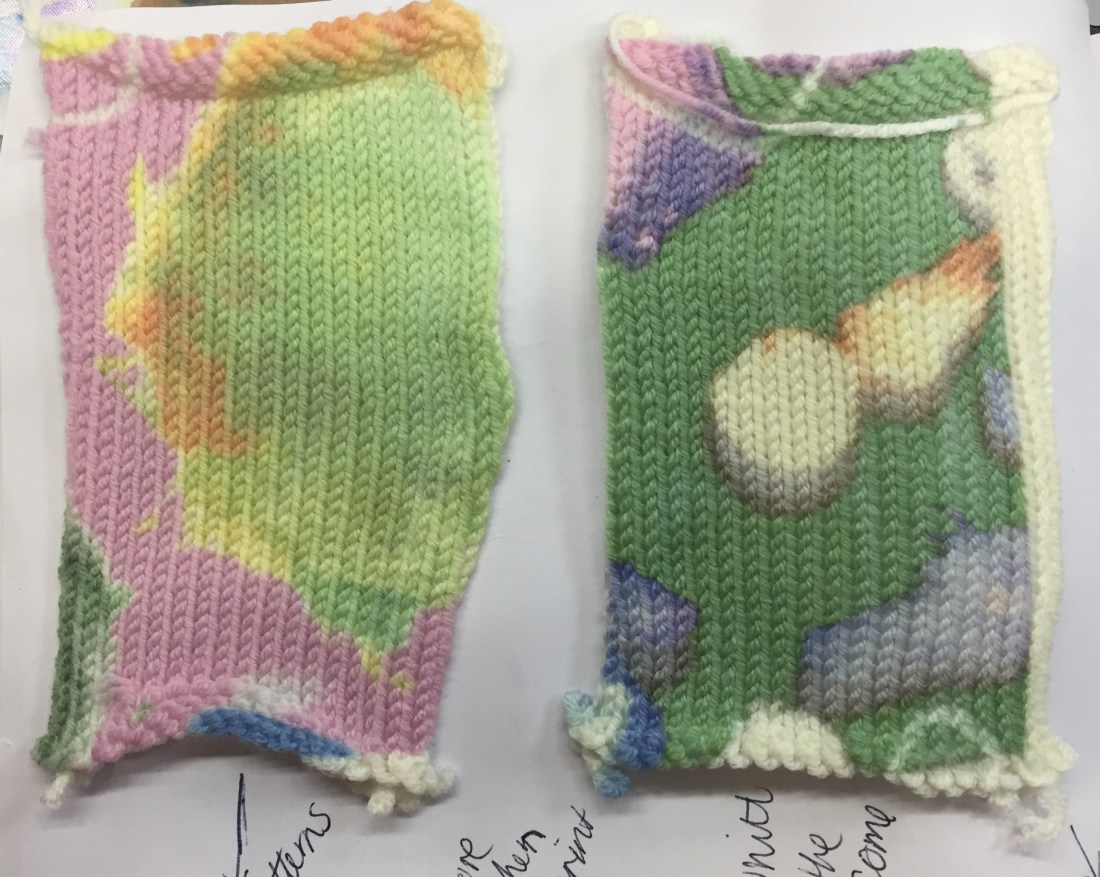
Each print is successful, however the green and the orange print was the best out of all the patterns, the pigmentation of the orange and the green are successful as they have both kept the boldness of the colours from the original print done of photoshop. However, the pink and lighter prink colours have faded on the fabric. The pink has faded compared to the other colours but still visible and really quite like that it is faded. The lighter pink has faded into the nude colour of the pop sock but the other colours from the paint have come out as they are darker. I could develop this further if I wanted to make the colours brighter on the pop sock by making the print itself darker or brighter on photoshop so that it would come out brighter on the sock.

FMP Developing Print onto Knit

After printing onto knit the first time it wasn’t as successful as I was hoping. I wanted to experiment further by trying to printing onto a lighter such as white to see whether the pigment of the colours on the print would be more successful then the last ones. the yarn I used was Baby Merino which is 100% wool. I was worried by it being 100% wool as I found after testing other fabrics, that print works better on sythetic fabrics. However, after printing on with the paint pattern in pink it came out really well more then what I was expecting. IMG_9546

Even the lighter colours such as the yellow has shown through clearly. I then wanted to test other prints such ones with pictures of people to see how clear the face and the body would come out on the knit. The face of my nan came out really clear and you can tell that its an image of my nan, however, I tried another pattern using my nan’s face but using brighter colours which was not successful. The facial features are not clear from where the colours are to bright and take over the detail of the face, having the print on photoshop the features where visible. To develop this I could use a lighter colour or change the opacity so that the colour is still there but with just lighter on the face so that you can see the facial features.

FMP Fabric Testing

Focusing on one print, I wanted to test the pigment and how vibrant this print would be on a variety of different fabrics. This allows me to then take for further development when rendering the prints into my designs to see whether a print would work with another print or how it will work on the garment or structure of the fabric. I didn’t want to just look at fabric materials, I wanted to focus on a range of materials that relate to my nan. I wanted to focus on the flower pattern that I developed from Pierre Bonnard exhibition. From my print research I have found that the best fabrics for print are synthetic materials. I have found that polyester satin has worked really well with the print, especially with the colours, making them vibrant and really stand out. Another successful material was the polyester open knit. With this fabric I was very surprised by the intensity of the colours on the fabric, even with the holes in the knit, the print is still visible and clear to what it is. However, I found that using a natural fabric such as calico, the vibrance of the print is not as affective as the other materials. Same as printing onto a nude knit, the colours aren’t as vibrant as I want them to be. I could develop this further by using a plain background such as a white and see how the print works with the white, which will hopefully allow the colour become brighter without another colour behind it.

FMP Mid Crit

Being half way through FMP I find it helpful to be able to get other opinions from other students about how I can develop my work. Even from different pathways so that I can look at how they are doing their work and then take some ideas to be able to help me and present my work. When receiving my book back I saw that one of the things that I needed to develop further was problem solving in my book. To achieve this I need to put more processes in my book, that I have found hard and put more fails in my book to show how I have solve this problem. I feel that most of my problem solving will come when I start to make my toiles and figuring out how to structure my garments together. I could develop these ideas further by picturing my process when making testings and now coming up to making my toiles.  A good example is my flower pattern, using knit in my first book putting in my fails and then showing the final outcome to demonstrate how I have overcome this problem, where I drew a template to help show which needle needs a different colour for me to create this pattern. Another development that I found from my crit from students and from my tutor, was to put more notes in my book to clearly show my ideas and what my work means to my topic of my nan. By making small notes just makes it easier for people that haven’t seen my work before to understand my journey and process from my research to my final garment of my topic of my nan.

FMP Laser Cutting

This week I wanted to expand my ideas and prints by using different materials to print on. I found through my research some shapes that she had in her clothing, which I then developed to have laser cut. I found the inspiration for this idea from the designer Stefan Cooke. By using laser cutting to create shapes and then print on prints to make it look like the shape of a jumper. I then wanted to experiment for myself and to see whether my prints would work in the same way as his. I had to problem solve and think of a material that would be ale to show the print through but also wouldn’t be to thin that it would melt when transferring the pattern onto the cuttings. I came across a material called clear acrylic, which is a more recent created material, and thought that it would be perfect to be able to hold the shape and show through. From this laser cutting workshop it allowed me to broaden my ideas by using different materials not just fabric all the time. When I first printed onto my laser cutting, the print didn’t transfer well and made the pattern’s colour patchy. I hated this and want to be able to create the print to show clearly on the acrylic. By asking help from the technicians, she told me that it would be better if the temperature was higher on 180 degrees instead of 150 and having a longer time of 30 seconds instead of 20. This was successful and I really like how the print have come out. the darker colour prints have come out better because they have made the acrylic translucent so you can’t see clearly through, whereas the lighter colours such as pinks and yellows you can see clearly through. When I go onto develop this idea and if I use this idea as part of my final piece I would use a darker print so that it stands out more.


FMP First Design Board

Seeing in my sketch book after most of my initial designs, for me to be able to move on with a couple of designs and develop them further, creating a Design Board then lets me narrow it down and really focusing on rendering some of my chosen designs. I have a couple of stand work and ideas that I really want to focus on and take forth for my final FMP outcome. When I first made my design board I wasn’t happy with the layout and the idea that I was trying to get across. I feel that it didn’t have an equal amount of stand work, not enough colour samples and to much research that it took most of the room up on the page. However, I feel that the collaging and the drawing really displayed my idea of the silhouette and details that I would like to take forward into further development. I could then start to look at adding patterns to the board. What the designs might look like with the prints or colours together on the garment. I could do this by photoshop and adding in the colours to drawing or stand work, or even simpler I could print the silhouette out with the print and collage then together. To develop my board further, I could add some toile sample to the board to show the detailing in which I would like on the garment by collaging. What I could add to this design board now is fabric sampling to show which fabrics I would like to take forward for my designs.