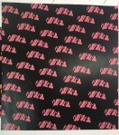
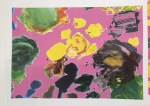
Through my research of my nan I wanted to some way involve prints, having seen her flat and clothing, the whole house is full of mixed match prints and objects which I have taken forward and rendered to trends now to make it new and developed. Having picked out my final prints that I like and what to take forward, I want to develop more because when I first created these prints I feel as though I haven’t developed them enough. Testing the positions, size, colour and filters that I have tried on photoshop to see which print I like the best and will work together in my technical drawings as I render them on the design. I wanted to keep the colours bold after going to Only Human: Martin Parr exhibition with his use of photography and making the colours in the photographs come alive and Mainly just keeping to the colours from the original print in which I tested before and chose which one I liked or the filter changed the colour. When developing these prints I knew that I had to keep the colours and shapes to the trend that I found on WGSN which then links to my customer, keeping the customer in my mind when choosing my final designs. The two designs that I didn’t want to take any further was the grey kitchen scene print I didn’t like how it came out the colours look really dark and the shape of the kitchen isn’t clear to see that its a kitchen and I really don’t like the colour of the green my nan doesn’t really have green in her flat only the carpet. The other design that I dont like is the scene print which is a print which shows the change of Bermondsey, after developing the print I wanted to try different filters to see what the filters would do to the line drawings, however the filters made the image look darker so that you can’t actually see the print only the top layers which doesn’t clearly show Bermondsey so the print wouldn’t really make sense, also placing with other prints I feel would be hard as most of my other print are quite dark so the garment as a hole will look to dark. However the two prints that I will be taking forward and really like are the pink flower print with the paint and the print repeated print. I really liked the paint print when I first created the print but I thought that the pink was to bright for the pink so I toned down the pink to make it a lighter shade which then I took this idea forward and changed the pink on the black design so that the colours ran through together. I was worried at first with this design as there is so many different colours and would find it hard to match with but it was successful. As I said at the beginning with the prints coming mainly from my nan’s furniture and clothing I wanted to combine these areas of my research together so that the paint design represented the flower patterns in my nan’s flat and the black design is from my nan’s clothing in which I extracted the shape from originally. I also really like the colours how they have revived the prints from the originals into something that somebody young could wear.