After visiting Pierre Bonnard exhibition, ‘The Colour Of Memory’ using his techniques such as brush strokes and bold colours to enhance the memories almost making them vivid to the viewer as though they where there at the time. I wanted to then develop these ideas to match my own theme using images of my nans flat and some of Bermondsey. While creating these responses i used acetate to mix my colours together for the images but found that when i turn’t the acetate over it created a mixed, messy floral pattern that looked like it had been blurred like in some of the research from my nans pictures. From this I have scanned in the work and played around with colours keeping the paint colours the same, however, changing the background. I wanted to choose the colours from the paint, to really show but also I looked on WGSN for the colour trend boards to see what colours I should be looking at. Also extracting colours from my nan’s flat especially from the wall paper. However, I really like the orange and bright pink responses. I have used the trend boards to make the colours extreme, using bold colours for it to stand out. I can develop this idea by maybe testing the prints onto fabric or maybe embroider the patter. 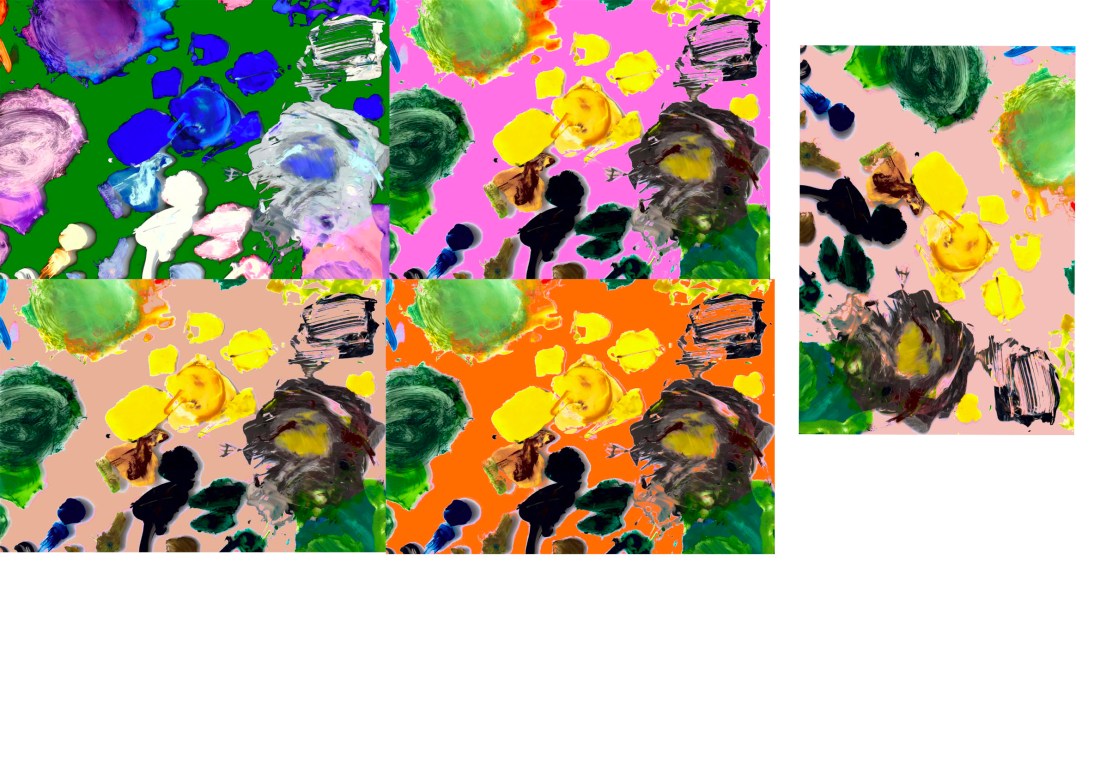
FMP Developing Pierre
Published
